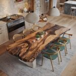
A simple kitchen design might mean flat cabinet doors and matte laminate that cost a fraction of solid wood, or it might mean layered lighting and quartz countertops that anchor the room with consistent veining across every slab.
The right choice depends on whether you’re adding open shelving to a rental or sizing an island for a layout you’re building from the ground up.
Under-cabinet LED strips install with adhesive backing in an afternoon; pull-out shelves bring deep cabinet contents to the front without kneeling or reaching past the first row.
1. Open Shelving
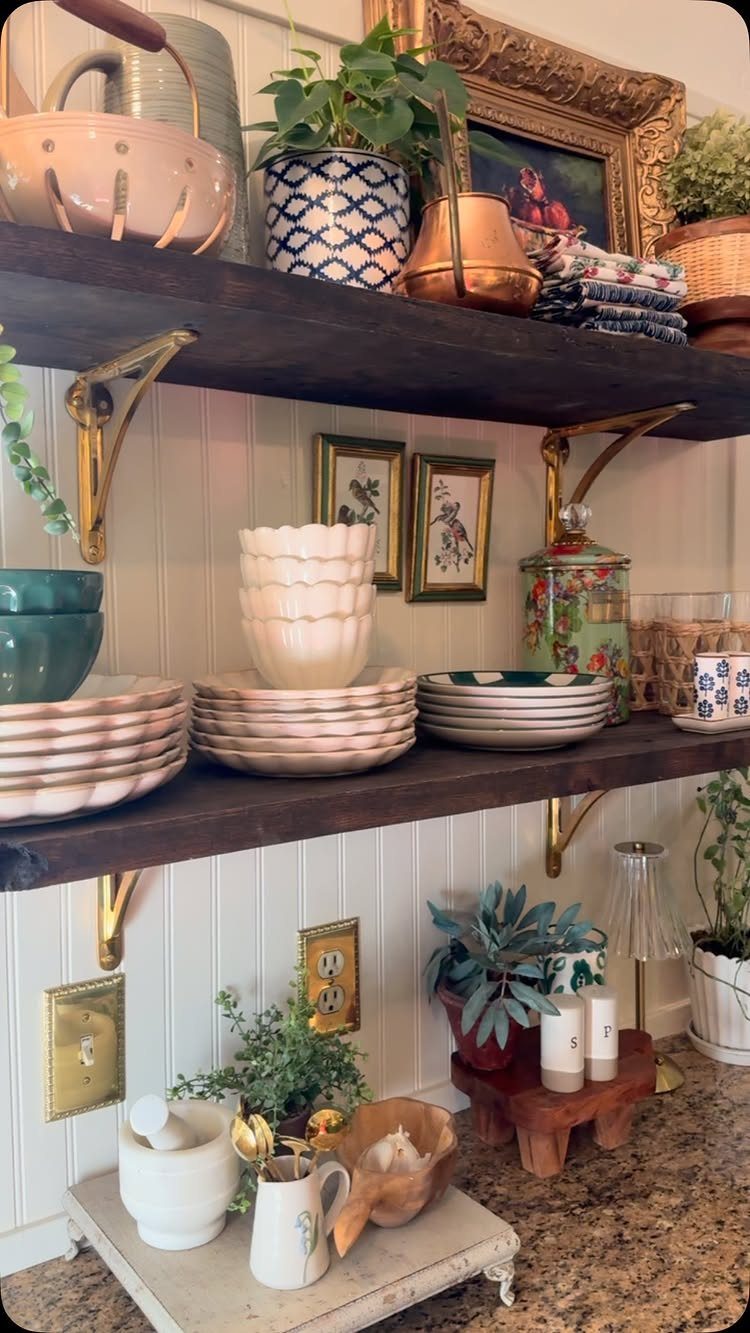
Open shelves keep everyday plates and bowls within reach and let a small kitchen feel less boxed in.
I’d swap 1 or 2 upper cabinets rather than all of them, so you still have closed storage for things you don’t want on view.
Brackets and shelf material set the look. Wood shelves on metal brackets suit a warm, casual kitchen; a single floating shelf in the same finish as the cabinets keeps the line clean.
Dust lands on open shelves, so this works best for items you use often enough that they don’t sit untouched for weeks.
2. Under-Cabinet Lighting

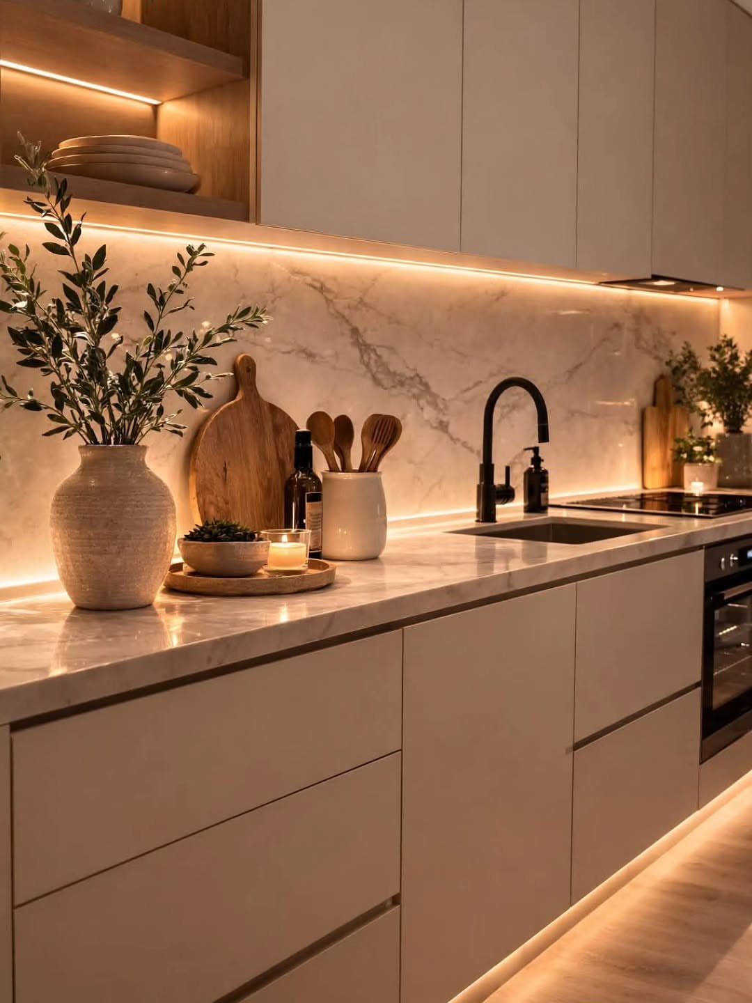
Lighting mounted under the cabinets puts light right where you need it when chopping or reading a recipe. It also fills in the shadow that overhead lights cast when you stand at the counter.
LED strip lights or puck lights install with adhesive backing or a few screws. Plug-in versions connect to an outlet; hard-wired ones tie into the kitchen circuit and work with the wall switch.
Warm white (2700–3000K) keeps the kitchen comfortable at night. Bright white works if you want task lighting that shows food colour accurately.
3. Use Light Colours
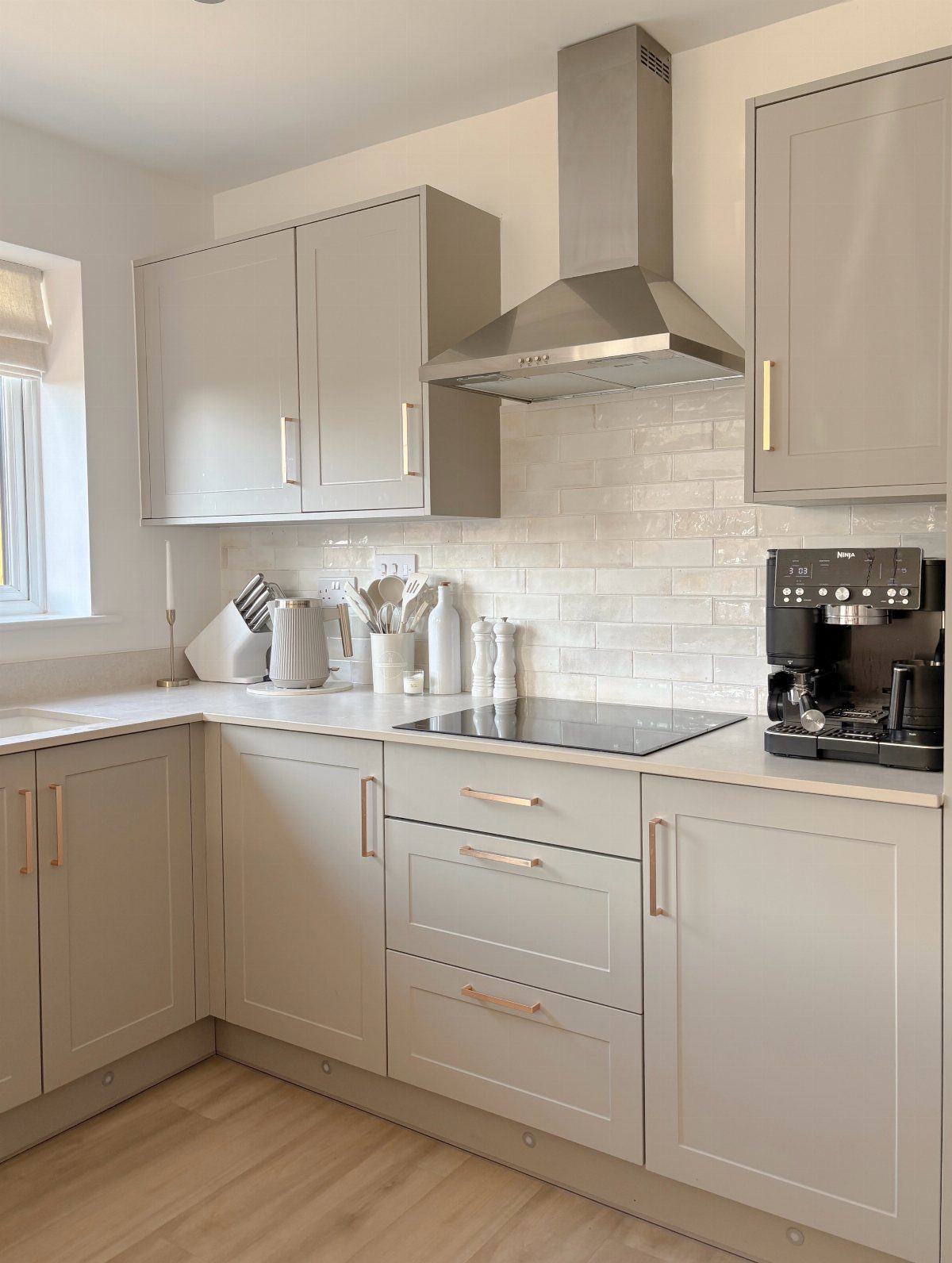
Light cabinets and walls reflect more light, so a compact kitchen reads as more open. White, pale grey, soft beige, and light wood finishes all do this without feeling cold.
If the room gets little natural light, a light colour on the cabinets helps more than anything else you could change. Pair it with a white or light-toned backsplash and countertop to keep the effect consistent.
You can still bring in darker tones through the floor, an island, or lower cabinets, but keeping the upper portion light makes the biggest difference in how spacious the room feels.
4. Use an Island

An island gives you counter space for prep, a spot for 2 or 3 stools, and storage or appliances underneath. It works when you have enough clearance on all sides where people walk; too little and the kitchen feels tight.
A fixed island is a cabinet base with a countertop. A rolling cart gives you the same surface and storage but moves out of the way when you need the floor space.
If the room is narrow, a peninsula attached to one wall gives you the extra counter and leaves more floor area.
5. Add a Backsplash
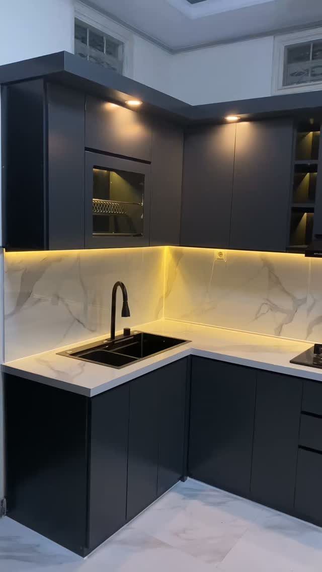
A backsplash protects the wall from splashes and grease while giving you a chance to add pattern or a contrasting material. Tile, stone, and solid-surface panels all work; tile is the most budget-friendly and the easiest to install yourself.
Subway tile in white or a light colour keeps the look simple and pairs with any cabinet finish.
For more visual weight, use a darker grout or a patterned tile, but keep it to the area between the counter and the upper cabinets so it doesn’t dominate the room.
Peel-and-stick tile is an option for renters or a temporary refresh. It installs in an afternoon and comes off without damage.
6. Straight Kitchen
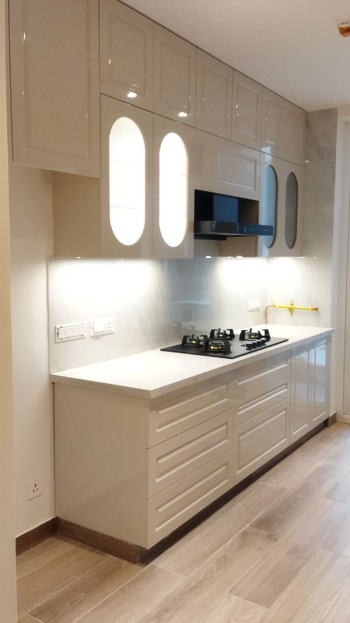
A straight kitchen lines everything up along one wall: sink, stove, refrigerator, and all the counter and storage space. It suits a narrow room or an open floor plan where the kitchen shares space with the living area.
You lose the work triangle, so I’d place the sink in the middle with the stove and refrigerator on either side, keeping the most-used zone within a few steps.
Counter space matters more here than in other layouts, since you don’t have an opposite wall to set things down on.
This layout costs less to install than an L or U shape because the plumbing and electrical all run along one wall.
It also leaves the rest of the room open for a table or an island if the space allows.
7. L-Shaped Kitchen
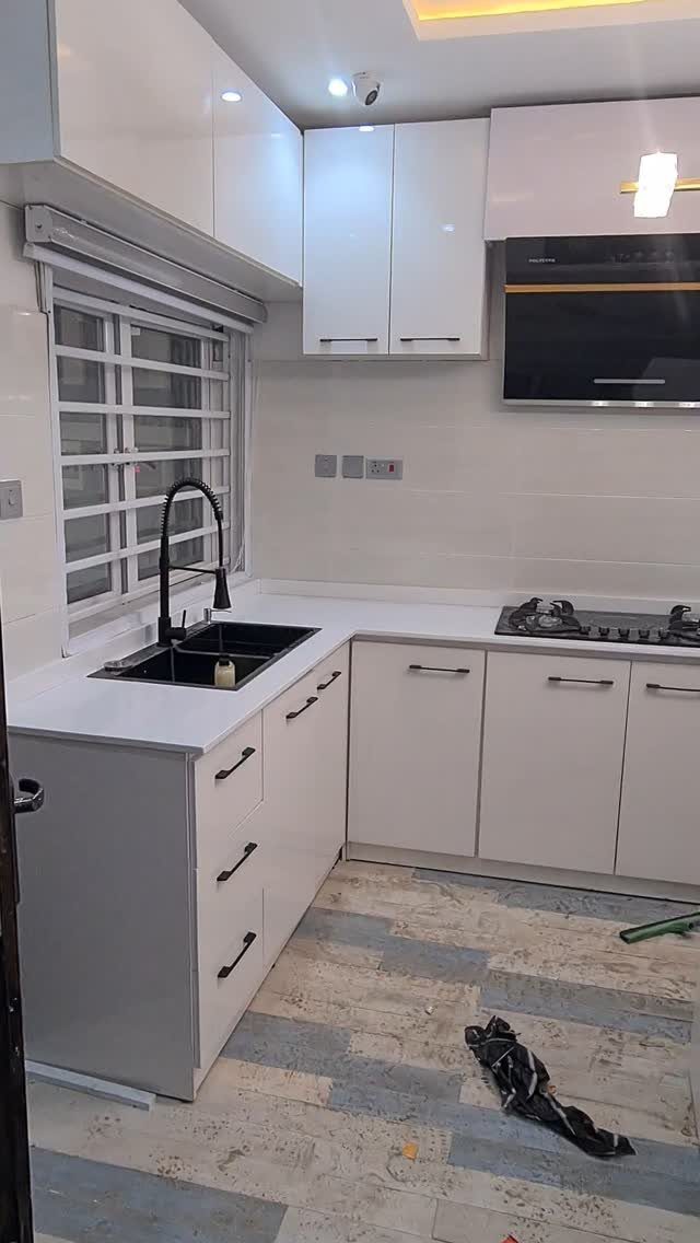
Cabinets wrap 2 perpendicular walls in an L, clustering the sink, stove, and fridge without stringing them into a single line. The corner where the 2 runs meet usually holds a lazy Susan or a pull-out shelf so that space stays usable.
This layout fits a square or nearly square room better than a straight run does, and it leaves floor space open for a small table or an island.
I’d put the sink on one leg of the L and the stove on the other, with the refrigerator at one end, so you move in a triangle between the 3 most-used spots.
The corner cabinet needs a plan. A blind corner leaves dead space; a diagonal door or a corner drawer unit makes better use of it.
8. Parallel Kitchen
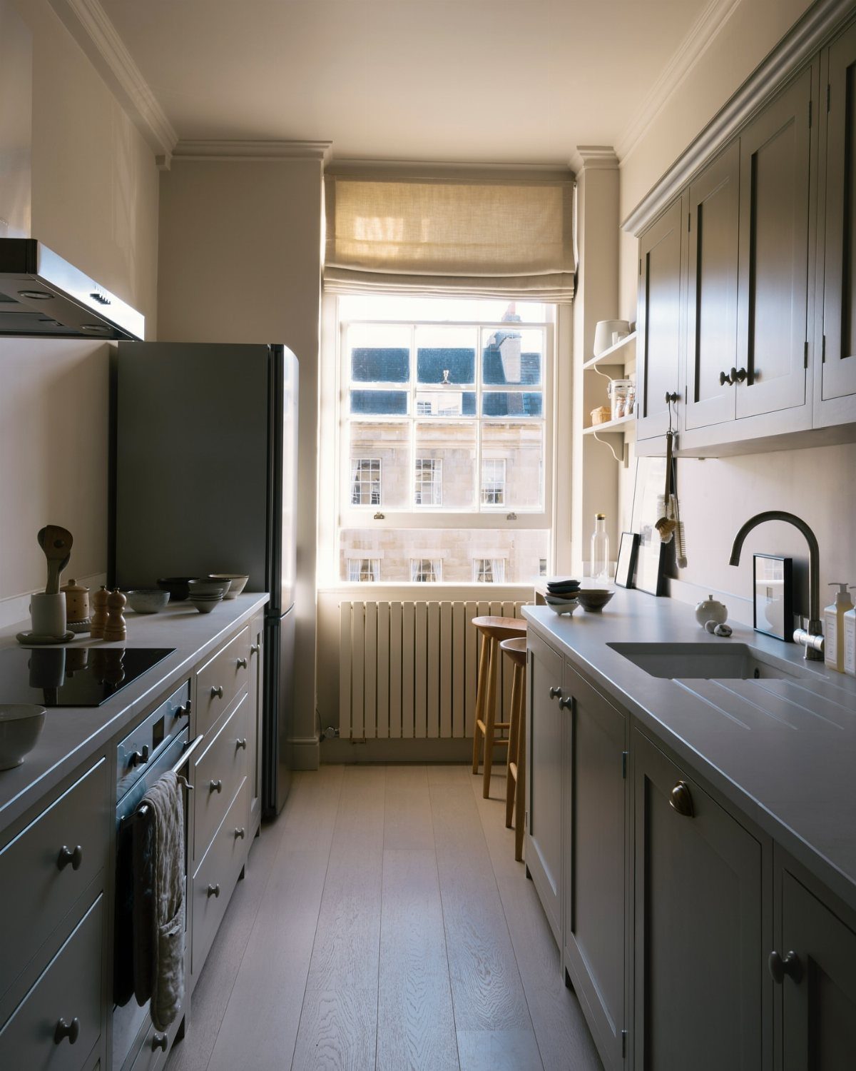
2 counters face each other across a narrow room with a path down the middle. Each side holds its own run of cabinets, and the refrigerator, stove, and sink split between them.
This layout works when the room is too narrow for an island but long enough to fit everything you need on 2 walls. I’d place the stove and sink on opposite sides so spills and splashes stay contained to one counter.
The aisle needs enough width for cabinet doors and drawers to open while someone stands in the middle. Too narrow and you bump into the opposite cabinet; too wide and you walk miles between the stove and the sink.
9. Flat Cabinet Doors

A flat door has no raised panel, routed edge, or frame detail. It’s a single plane from edge to edge, and that simplicity makes a small kitchen feel less busy.
Slab doors come in every material cabinets are made from: wood, laminate, thermofoil, or painted MDF.
The cost depends on the material, not the style. A flat door in laminate costs less than a carved door in solid wood, but a flat door in solid walnut costs more than a raised panel in oak.
This style shows every fingerprint and smudge on a glossy finish, so a matte surface or a wood grain hides daily wear better.
10. Matte Laminates
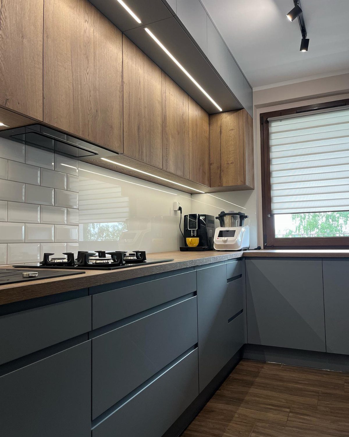
A matte laminate finish on cabinets resists fingerprints better than gloss and softens the look of a small kitchen by scattering light instead of reflecting it sharply.
Laminate is a thin plastic layer bonded to particleboard or MDF, and the matte version costs the same as the glossy.
Laminate holds up to moisture and heat better than paint, and it doesn’t need sealing the way wood does. Scratches show more on dark matte finishes than on light ones, but a melamine repair pen fills shallow marks.
This material keeps the budget down. Laminate cabinets cost a fraction of solid wood and install the same way.
11. Layered Lighting
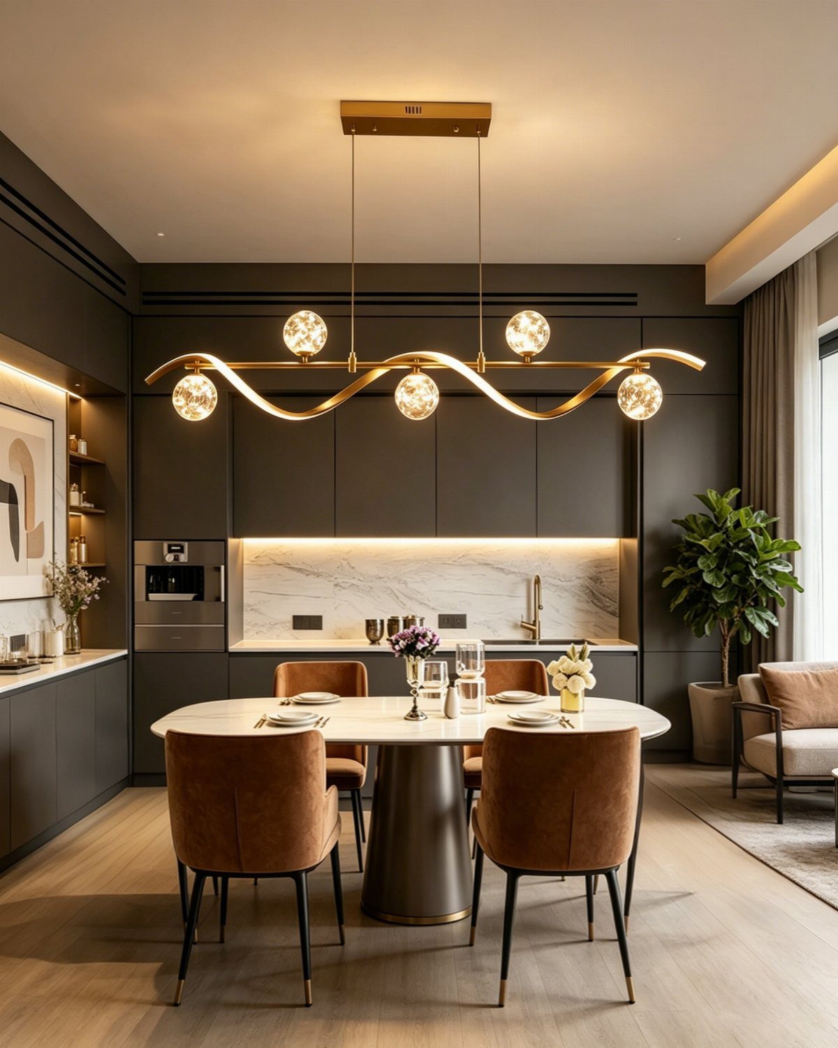
A single overhead light leaves shadows where you work and makes the whole room feel flat. Layering fixes that: a ceiling fixture for general light, under-cabinet strips for the counters, and a pendant or chandelier over the table or island.
I’d start with the task lighting, since that’s what makes the kitchen usable at night. Then add the ambient layer, and finish with the accent piece if the room has space for one.
Dimmers on each layer let you adjust the mood. Bright light for cooking, softer light for eating, and just the under-cabinet strip on when you walk through at night.
“What was once a galley-style kitchen is now a functioning modern day kitchen with a nod to its early 20th-century roots.”
12. Wall Ovens at Eye Level
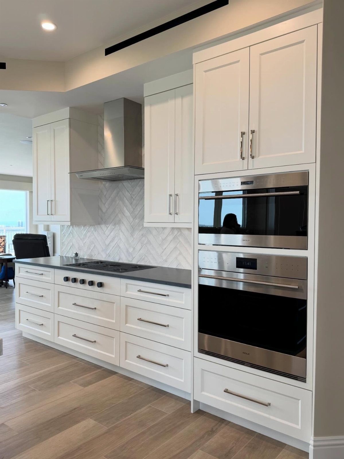
A wall oven installs at chest height in a tall cabinet, so you don’t bend to the floor every time you check on food.
It frees up the space below the cooktop and splits the oven from the range, which gives you more counter area between the 2.
A double oven stacks 2 in the same opening, and each one is smaller than a single but lets you cook at 2 temperatures at once.
This setup costs more than a range.
13. Two-Tone Cabinets
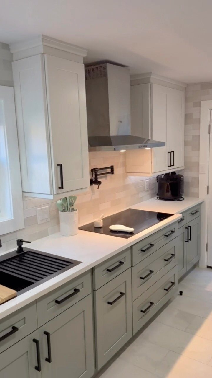
Upper cabinets in one colour and lowers in another break up a wall of cabinetry without adding pattern or texture. White or light grey on top keeps the room feeling open; a darker or bolder colour below grounds it.
The split usually happens at the counter, where the 2 materials already meet. Matching the upper cabinets to the wall colour makes them recede; contrasting them with the lowers draws more attention to the divide.
This approach lets you bring in a strong colour without committing the whole kitchen to it.
14. Open Floor Plan
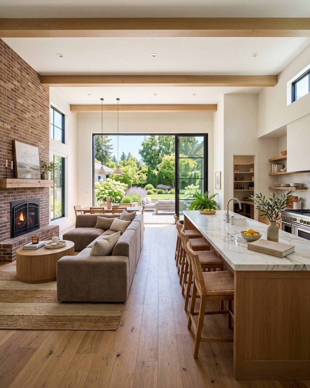
When the kitchen opens into the living or dining area, repeating one material between the two spaces ties them together visually.
The same wood tone on cabinets and built-ins, or the same colour on trim in both rooms, makes the transition feel intentional instead of abrupt.
Flooring that runs through both areas does the same thing and makes the combined space read as larger. If you change materials at the threshold, the kitchen starts to feel like a separate room again.
15. Add a Peninsula
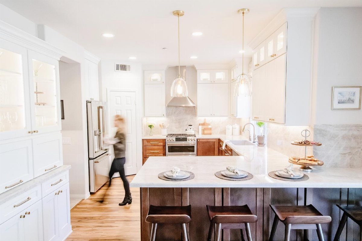
A peninsula attaches to one wall or the end of a cabinet run and extends into the room, giving you extra counter space and a spot for stools without needing clearance all around the way an island does.
It works in a narrow kitchen where an island would block the path or in an open floor plan where you want a visual boundary between the kitchen and the next room.
The attached end can hold the sink or the cooktop, with plumbing or electrical running through the wall behind it.
One side stays open for seating; the other side faces the kitchen and holds storage or appliances underneath.
16. Balance Strong Colour

A saturated cabinet colour holds more weight in a small kitchen, so pairing it with white, off-white, or light grey on the counters, walls, and backsplash keeps the room from feeling heavy.
The neutral surfaces reflect light and let the coloured cabinets be the focus without competing for attention.
If the cabinets are dark or bold, a light floor helps too. The reverse works as well: dark counters or floors with light cabinets, as long as one element stays pale enough to keep the space feeling open.
17. Decorative Details

Small details like fluted cabinet ends, reeded glass inserts, decorative hardware, or woven pendant lights add texture and character without changing the layout or the cost much.
They work best when you pick one or two and repeat them, so the kitchen feels pulled together instead of busy.
I’d choose details that suit the style you’re already building toward. Brass or gold hardware warms up a light wood kitchen; ribbed glass on a few upper cabinets softens the look of a solid wall of doors.
Too many different details compete with each other, so one strong choice usually does more than three small ones.
18. Display Art
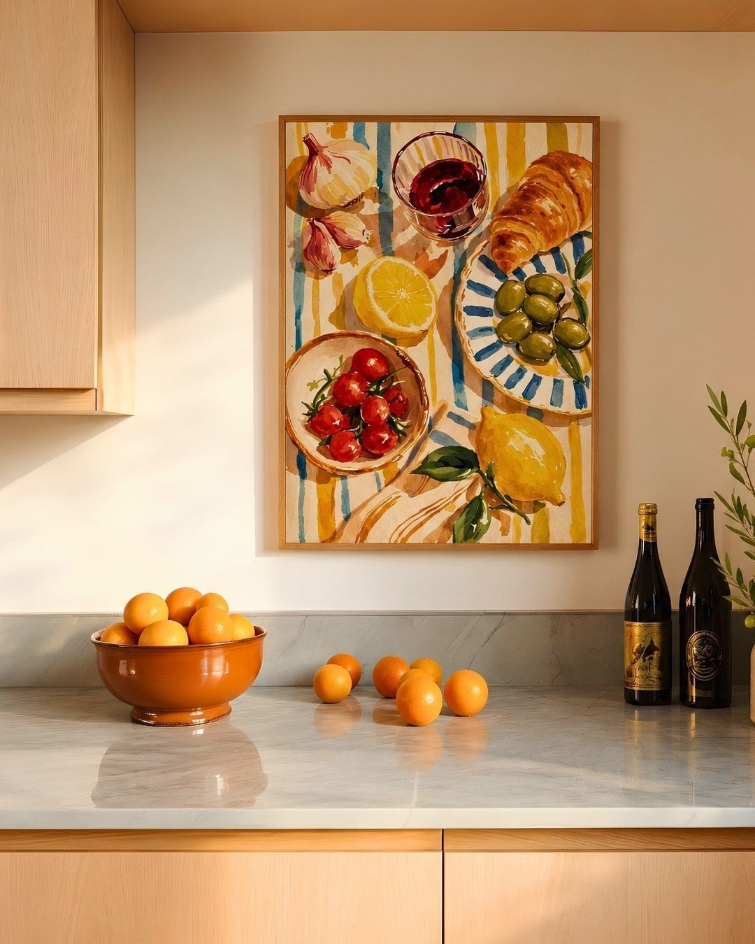
Hanging a piece of art on an open wall brings in colour and personality the same way it does in any other room.
A framed print or painting above the counter, between cabinets, or on the wall opposite the sink gives you something to look at while you work.
The piece needs a spot where it won’t take splashes or steam. A wall behind the table or away from the stove holds up better than one right next to the cooktop.
If you don’t have wall space, a small piece on a floating shelf or propped on the counter does the same thing on a smaller scale.
19. Mix Wood and White
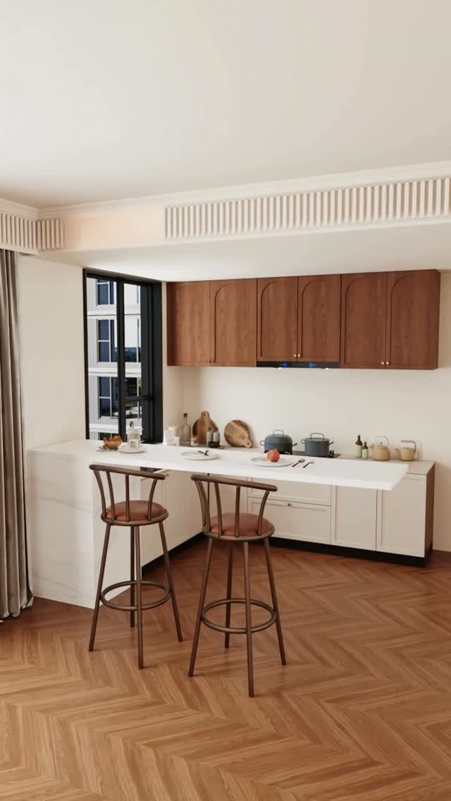
White and wood pair well because they balance each other: white keeps the room feeling open, and wood brings in warmth that stops it from reading cold or clinical.
To keep the mix from feeling random, repeat both tones from the floor up through the cabinets and ceiling so the room reads as a single palette.
If the floor is already a warm wood, match the cabinet wood to it rather than choosing a second tone. 2 different browns in the same room tend to look like a mistake rather than a choice.
20. Warm Neutral Cabinets
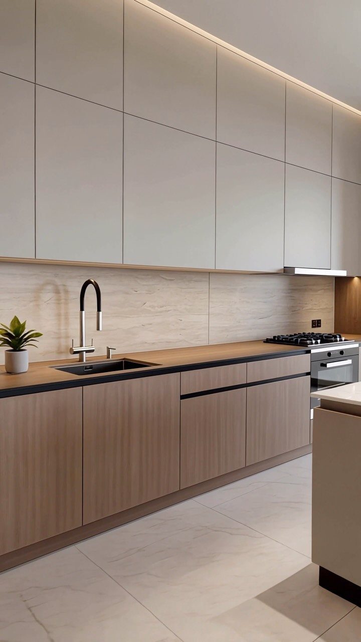
Beige upper cabinets and light wood lowers work because neither one demands attention. The room stays quiet, the black countertop gives it enough contrast to read as intentional, and the white floor keeps everything feeling bright.
This combination suits a small kitchen. Nothing about it fights for space, so the room doesn’t feel crowded even when the square footage is tight.
Warm neutrals like these age better than trendy colors, which look dated once their moment passes.
21. Sage Green Cabinets

Sage green sits far enough from true green to read as a neutral in most rooms. Paired with raw wood countertops and a white field, as in this kitchen, it leans calm rather than bold.
It works in a room with natural light. Against a north-facing wall with little sunlight, the same colour can go grey and flat.
Matte paint or a matte laminate finish suits this colour better than gloss, which tends to make the green look more saturated than you intended.
22. Black Countertop Contrast

Black countertops do one thing very reliably: they define where the counter ends and the cabinet begins. Against white cabinetry, that line is sharp, and the kitchen reads as crisp and well-organized even when the layout is straightforward.
The wood barstools here soften the contrast and keep the room from feeling stark. A couple of warmer materials, whether wood, wicker, or a linen-toned rug, do the same job in any version of this combination.
Black shows water spots and light-coloured crumbs, so stone or quartz with a honed finish hides daily wear better than polished.
23. Simple Counter Styling
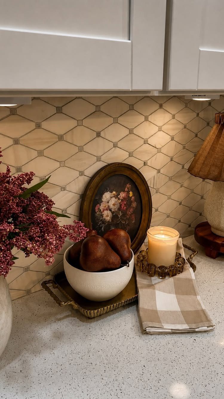
Counter styling works when it stays selective. A bowl of fruit, a single candle, and one small piece of art take up very little space but give the counter a point of interest that a cleared surface doesn’t have.
Holding the pieces to one warm, earthy palette is what makes a counter grouping feel deliberate rather than random. Colour is the easiest way to tie a few unrelated things together.
Keep it to one cluster rather than spreading pieces along the full counter length.
24. Pull-Out Shelves
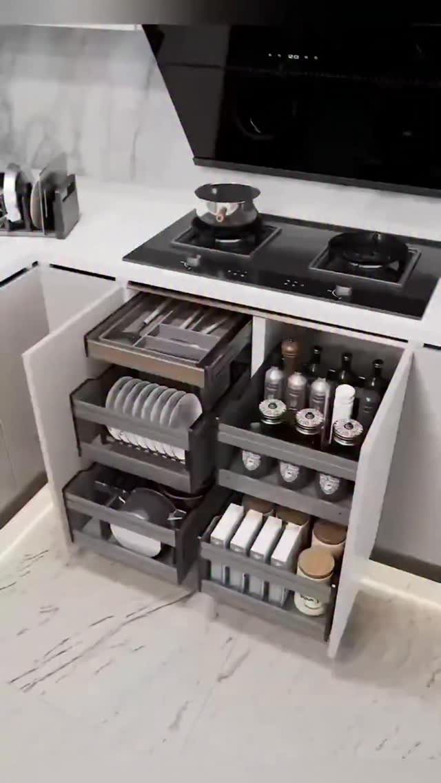
Pull-out shelves replace a fixed cabinet interior with tiered drawers that slide all the way out, so nothing disappears into the back. Every item stays visible and within reach without moving anything else first.
Most cabinet boxes can be retrofitted with pull-out shelf hardware without replacing the door or the box itself. Full-extension slides are worth the small extra cost; a shelf that stops short of fully open still hides things in the back.
Deep lower cabinets next to the stove are the first place I’d install them.
25. Quartz Countertops
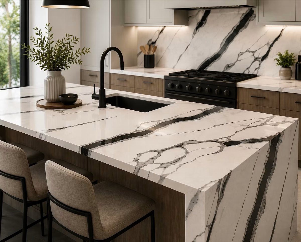
Quartz is engineered stone: ground quartz bound with resin, so the veining runs consistent across every slab and the surface never needs sealing.
Heavy veining pulls as much visual weight as a decorative tile or a bold cabinet color, so a slab with strong pattern can anchor the whole room on its own.
Quartz resists staining better than marble and holds up to cutting and heat better than laminate, though a hot pan straight from the burner can damage the resin over time.
26. Corner Carousel
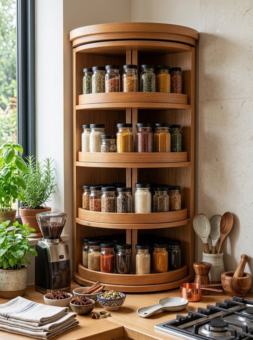
Corner cabinets lose more usable space than almost any other cabinet in the kitchen, because most of what goes in never comes back out without a full crouch and a search.
A rotating unit fixes the access problem without requiring any cabinetry changes beyond swapping out the shelves inside.
The spice version keeps the rotation tight and shallow, which suits countertop use without claiming the space a full lazy Susan would need.
27. Tall Storage Unit
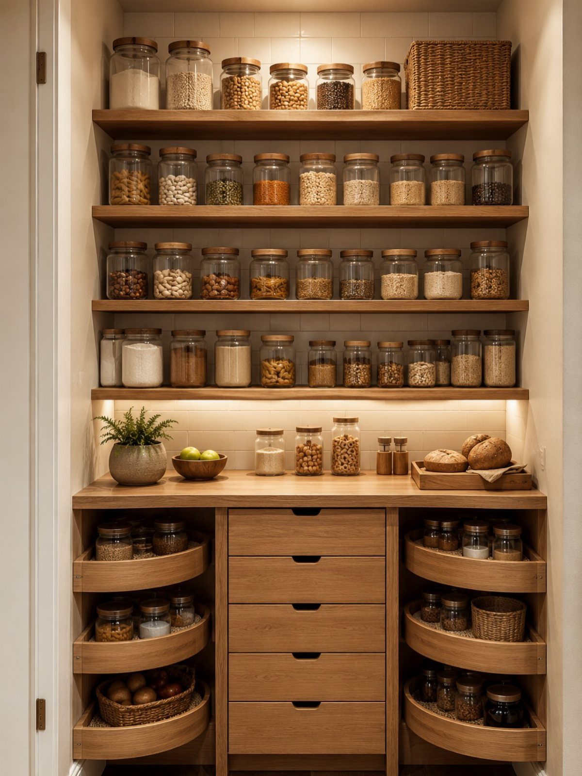
Floor-to-ceiling height is storage square footage that base cabinets and wall cabinets together rarely use fully.
A tall unit consolidates that vertical run into one piece: open shelves up top for things you reach daily, deeper drawers below for bulk or less-used items.
The curved pull-out drawers in this kitchen suit a standalone pantry unit particularly well since they clear the frame without wasted space at the corners.
Glass jars on open shelves also pull double duty as organization and display.
28. Slim Pull-Out Pantry
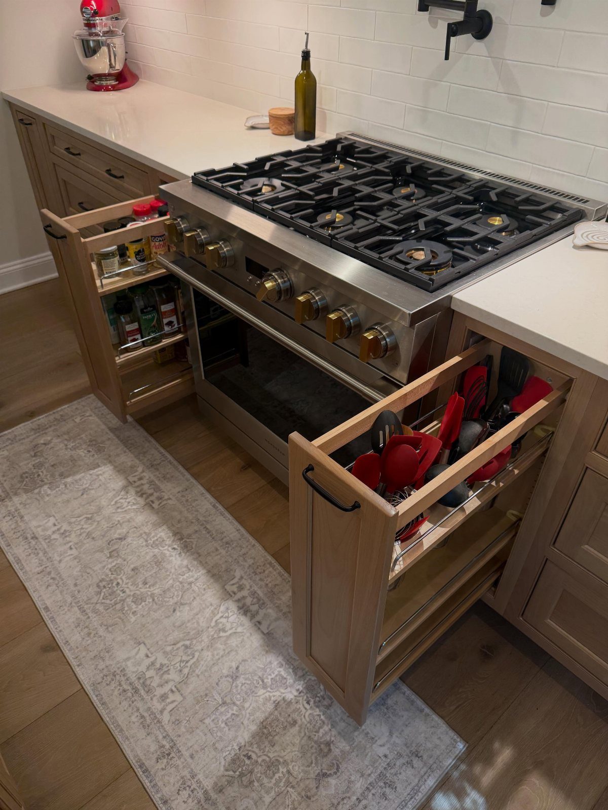
A slim pull-out pantry fits into a gap as narrow as 6 inches and slides out to give you full visibility of everything stacked on it, which a standard cabinet door never does.
The pair flanking this range hold spices and utensils right where they get used: close to the cooktop, a short reach away while something is on the heat.
29. Clear Pantry Containers
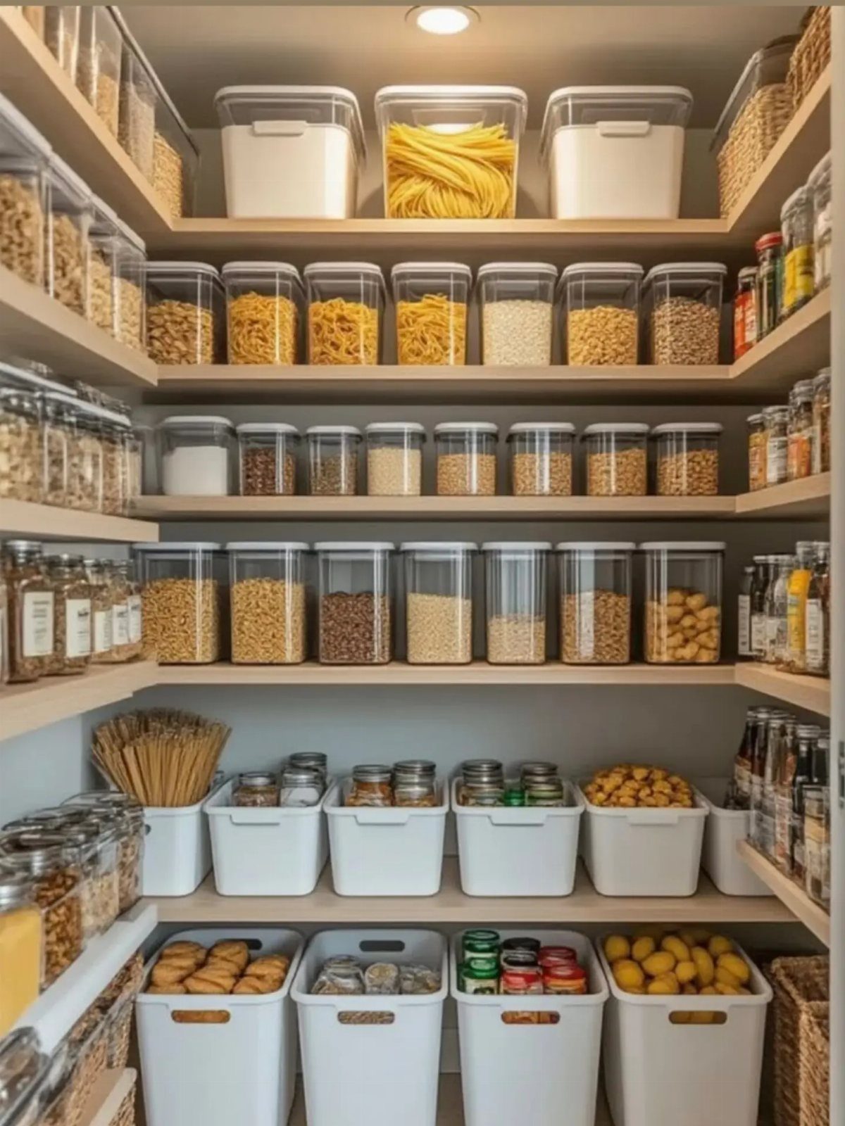
Clear containers solve a pantry problem that labels alone don’t: at a glance, you can see what’s running low without pulling anything off the shelf.
Uniform containers also let you stack more tightly and use shelf depth all the way to the back.
Square or rectangular containers fit shelves more efficiently than round ones, since they stack without gaps at the sides.
White bins on the lower shelves handle the bulkier items that don’t fit standard containers well.
30. Large Windows
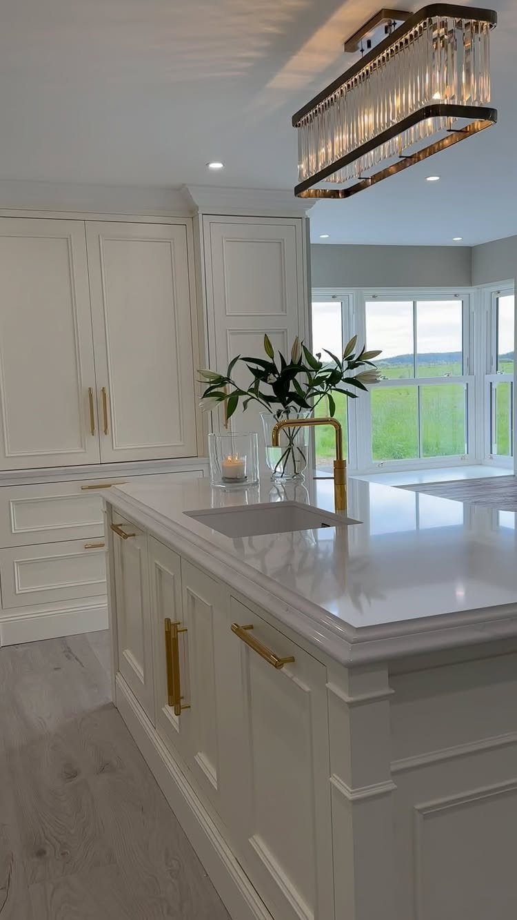
Natural light changes a kitchen more than almost any finish or fixture. A room that reads white and bright in a photo often relies less on the cabinetry color and more on the window area behind it.
If a renovation is on the table, enlarging an existing window costs far less than adding one in a new location, since the framing and lintel are already there.
The chandelier here works because the daylight keeps the room from reading formal.
31. Built-In Storage
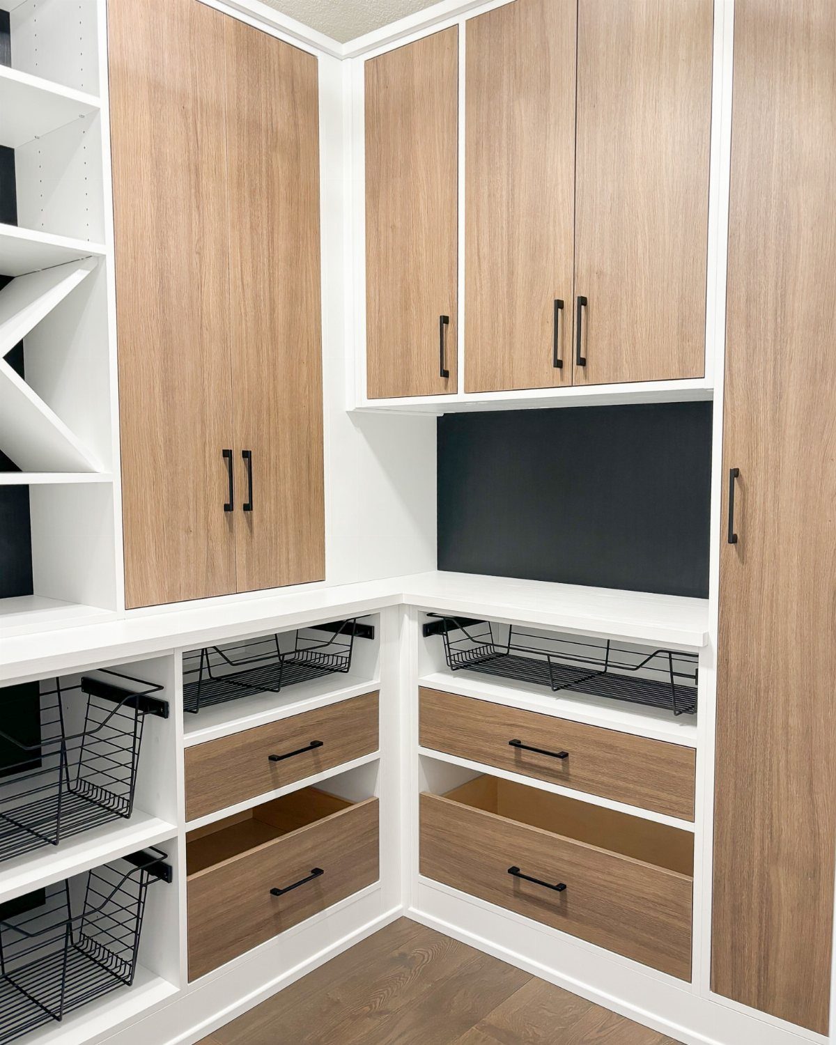
Built-ins pull storage directly into the structure of the room instead of relying on freestanding pieces that shift or stack awkwardly. Every wall, alcove, and gap becomes usable.
Mixing fixed drawers with open wire baskets works because bulkier items and frequently grabbed things each land in storage that actually suits them. A chalkboard panel on one section keeps a running list off the counter entirely.
Drawers beneath and baskets above is an arrangement worth copying: heavy things stay low, and the open fronts of the baskets mean nothing disappears.
32. Space-Saving Solutions
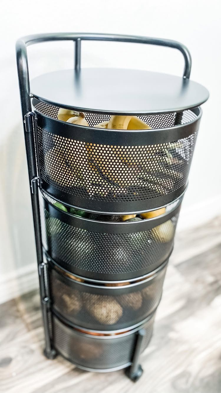
Vertical tiered storage earns floor space back by stacking what would otherwise spread across a counter or crowd a pantry shelf.
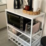
A 4-tier metal mesh unit holds produce at room temperature while letting air circulate around it, which matters more for potatoes and bananas than a closed cabinet does.
Mesh sides let you see what’s there without moving anything.
For a small kitchen with no pantry, a unit this size does real work for almost no investment.
Kitchen Dimensions and Workflow
Counter height runs 32–36 inches for most adults; a 24-inch counter depth keeps the work surface within reach without pushing you away from the sink.
Overhead cabinets sit 18 inches above the counter, which leaves clearance for appliances and still puts the shelves you use most at a comfortable reach.
Walkways need at least 3 feet so 2 people can move without bumping into each other when a drawer is open.
The work triangle is the path between your sink, stove, and refrigerator — the 3 spots where most kitchen activity happens.
Shorter than that and everything crowds together; longer and you cover too much ground between the 3 points every time you cook.
Simple Kitchen Planning
Before anything else goes on a wall or into a cart, place the sink, refrigerator, stove, and any major appliances on paper. Those positions set where plumbing, electrical, and ventilation need to go, and moving them later costs real money.
Ventilation deserves a spot in the plan early. A range hood or an exhaust fan pulls cooking odors and steam out of the room; skipping it means grease and moisture settle on every surface over time.
Once the fixed points are set, map the traffic through the space. A clear path between the prep area, the stove, and the sink keeps cooking from feeling like an obstacle course, especially in a kitchen shared with anyone else.
Small Updates and Cleaning
A full renovation is rarely the right first move. Most kitchens feel cluttered or dated for one or two specific reasons, and fixing those gets you further than a gut remodel ever would.
Hardware is the lowest-cost swap with the most visible return: new pulls or knobs on every cabinet door reads as a different kitchen.
A new faucet, a peel-and-stick backsplash, or a magnetic knife strip each take an afternoon and address a real frustration rather than just adding decoration.
Wiping counters after every cooking session and resetting the kitchen at the end of the day keeps a simple space looking the way it did on the best day you’ve had in it.
Frequently Asked Questions
What makes a kitchen look simple but still smart?
Clean lines, light colors, and storage that keeps clutter off the counter do most of the work. A tight triangle between sink, stove and fridge cuts steps and lets you work without crossing your own path.
What are the basic layouts for a simple kitchen?
The four most common are the single-wall (everything on one run), the L-shape (cabinets on two perpendicular walls), the parallel or galley (two facing runs with an aisle between), and the peninsula (an L with an attached extension that doubles as a seating counter).
A single-wall layout costs less because all the plumbing and electrical run along one wall; an L suits a square room and leaves floor space open; a galley works in a narrow room; a peninsula gives you extra counter and seating without needing clearance all the way around.
What materials are best for a simple kitchen?
Quartz or laminate for countertops and matte laminate for cabinet faces hold up to daily use, resist moisture, and need very little maintenance. For flooring, tile, hardwood, or luxury vinyl all clean easily and last.
What is the difference between modular and non-modular kitchen cabinets?
Modular cabinets come in standard-width units that are assembled and installed as a set, which keeps costs lower and makes replacement or reconfiguration easier later.
Non-modular cabinetry is built to the exact dimensions of the room, so it fits odd corners and irregular walls without gaps, but it costs more and takes longer to install.
For most renters and first-home owners working with a standard room, modular units cover nearly every layout without the custom price.