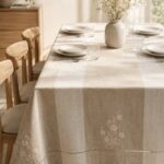

Kitchen cabinet color sets the baseline for every other finish in the room, and the right pairing depends on how much natural light the space gets and whether you are working with existing countertops or flooring.
White and wood cabinets reflect light in a small kitchen without closing it in, while deeper greens and blues pull focus and work best where the ceiling sits high and daylight reaches most of the room.
1. White and Warm Wood

White cabinetry keeps the space feeling open and light, while wood shelving, ceiling beams, or countertop edges bring in warmth without adding visual weight.
The combination works especially well in smaller kitchens where all-white might feel cold and wood-on-wood might close in the room.
Light wood tones like oak or maple read softer and more Scandinavian.
Walnut or teak skew richer and more grounded. Both need the right finish to handle moisture, and for wood that means a hardwood sealed properly.
If your kitchen gets strong natural light, the wood stays true to its tone. In a dimmer space, add under-cabinet lighting to keep the white from going gray.
2. Black and White

Black lower cabinets anchor the room while white uppers keep the ceiling from feeling low. The reverse works too: black uppers with white below, though that choice makes a smaller kitchen feel tighter.
If you are painting existing cabinets, black needs good surface prep; any brush mark or drip shows up under kitchen lighting. White is more forgiving on the first coat but yellows over time near the stove without a stain-blocking primer.
Matte black reads modern, but it shows fingerprints. Satin or semi-gloss wipes down easier and still keeps the contrast sharp.
3. Blue and White

Light blue cabinets soften a kitchen without losing definition, and the pairing feels calm rather than stark.
Powder blue or sky blue needs good natural light to read true. In a north-facing kitchen or one with only overhead fixtures, those pale tones can look washed out; a few shades darker holds its color.
Navy or cobalt blue pulls focus and works best as an island or lower cabinet color, with white keeping the upper half open. If the blue skews too cool, warm metal hardware like brass or bronze balances it out.
Blue shows cooking stains and grease more than white or gray, so plan on wiping down around the stove more often.
4. Green and White

Sage, olive, or soft mint cabinets paired with white countertops and walls bring color into the room without competing with the rest of the house.
Green reads fresh in a kitchen with a window or skylight; in a space lit only by ceiling fixtures, it can look muddy. Test a sample on the cabinet door that gets the least natural light before committing.
A deeper forest or hunter green works as an island or lower cabinet color for more contrast. White subway tile or a marble backsplash keeps the green from overwhelming the room.
Green paint fades faster than white near a south-facing window, so budget for a touch-up every few years if the cabinets sit in direct sun.
5. Taupe and White

Taupe sits between warm and cool, which makes it easier to match with existing flooring or countertops than a true gray or beige.
It pairs cleanly with white without the hard contrast of black, and the combination works in both traditional and modern kitchens.
If your taupe skews pink or orange, white subway tile or a cool-toned quartz countertop pulls it back toward neutral. If it leans gray, a warmer white like ivory or cream keeps the space from feeling too sterile.
Taupe hides dust and minor scuffs better than white, which matters if you are repainting and want the finish to last longer between touch-ups.
6. Gray and White
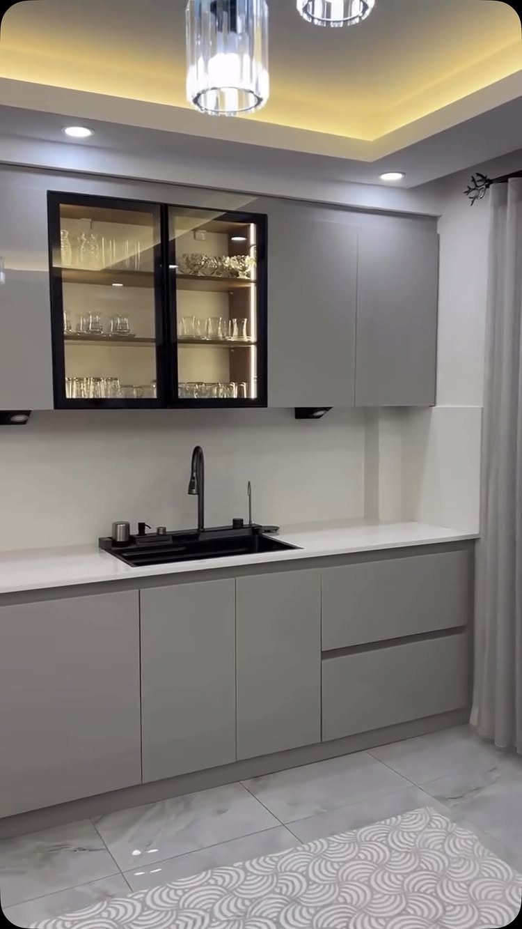
Light to medium gray cabinets give a kitchen a modern feel without the starkness of all-white or the weight of black.
Paired with white countertops and subway tile, the palette stays neutral enough to work with stainless appliances, brass hardware, or wood accents.
Gray shifts under different lighting. A color that looks soft in the showroom can read blue or purple under LED bulbs, and it darkens in a kitchen without much daylight.
Paint a sample board and check it at different times of day before picking a shade.
Darker grays show water spots and fingerprints, so a satin or semi-gloss finish cleans up more easily than matte.
7. Cream and Taupe
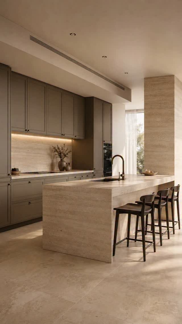
Cream and taupe sit close enough on the color wheel that the shift between them feels intentional rather than stark.
Cream cabinets with taupe walls, or the reverse, let you layer neutrals without the cooler edge of gray or the warmth of beige pulling the palette in one direction.
The combination works in kitchens where existing flooring or countertops already lean warm. If your space has honey oak floors or beige tile you are not replacing, cream and taupe tie in without fighting what is already there.
Both colors show less dirt than pure white, which matters around cabinet pulls and light switches.
8. Green and Natural Wood

Sage or olive green cabinets with a wood countertop or open shelving bring warmth without the heaviness of darker cabinetry. The wood tone matters: lighter oak or maple keeps the palette airy, while walnut or cherry deepens it.
Too much green can feel cold, but natural wood tones pull it back toward warm. If the wood is already in the room as flooring, match the shelving or island to it so the tones do not compete.
Green fades faster than wood near a sunny window, so plan to repaint the cabinets before refinishing the wood.
9. Black and Cream

A black countertop or hood against cream cabinets gives you definition without the starkness of white.
The pairing reads more formal than cream and wood, and the black grounds the space if the cream starts to feel too soft on its own.
A black granite or soapstone countertop hides stains better than lighter stone, which offsets the fact that cream shows splashes and grease more than darker cabinet colors.
If you are painting existing cabinets cream, a stain-blocking primer keeps tannins in the wood from bleeding through over time.
Gold or brass hardware warms up the black and keeps the cream from looking washed out under overhead lighting.
10. Blue and Brown

Soft blue cabinets with brown wood flooring or stools tie cooler tones to a warmer base.
The blue needs to stay light enough that the brown does not darken the room; powder or sky blue works, while navy pulls too much weight against darker wood.
Blue cabinets can tie into existing wood floors without needing a perfect match.
Oak or maple keeps things from tipping too dark. Darker walnut or cherry needs a lighter blue to avoid closing in the room.
White countertops between the two colors keep them from blending into one mid-tone.
11. Blue and Yellow
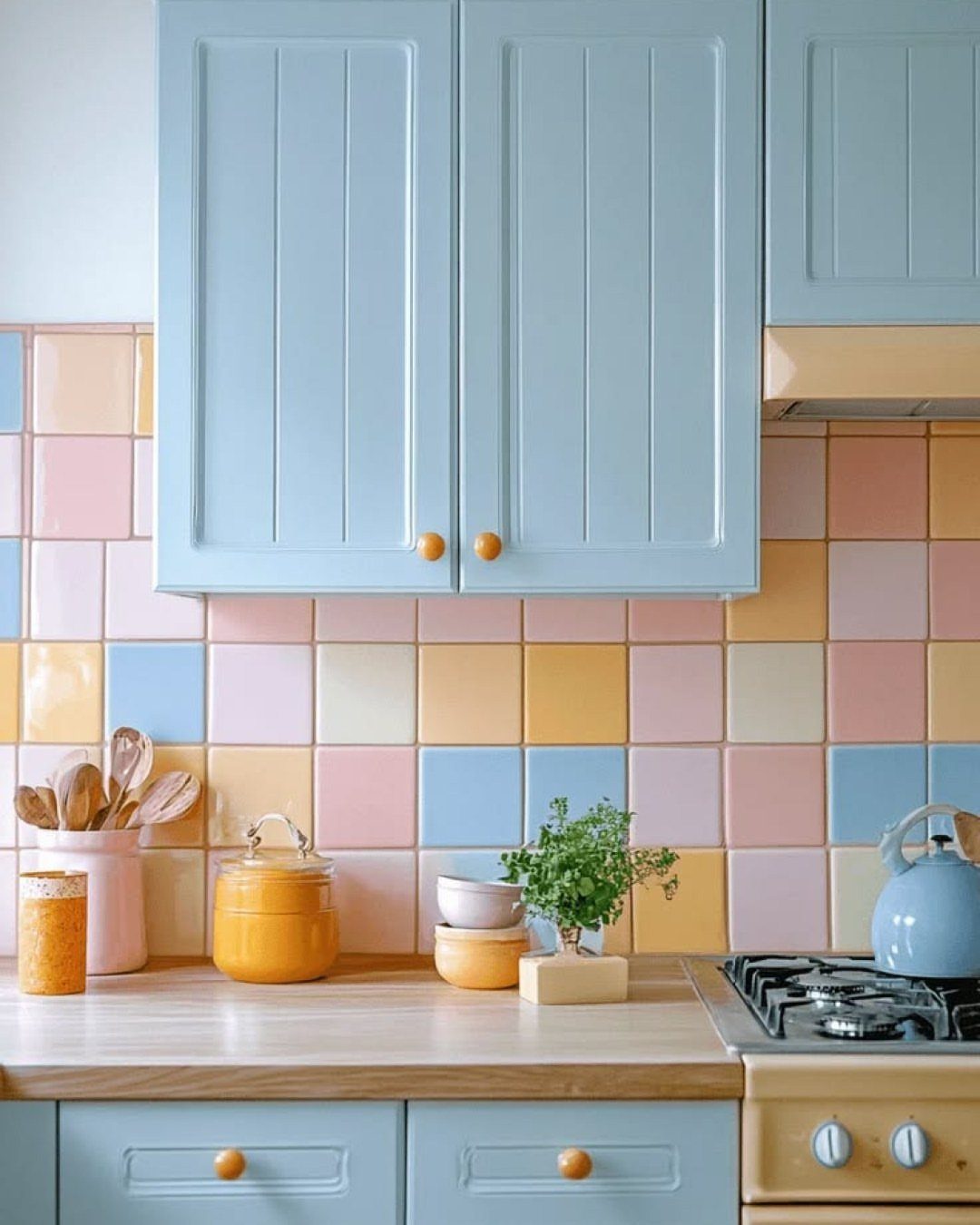
Soft blue cabinets with yellow cookware, dishware, or small appliances add warmth without committing to a permanent second color. The pairing feels more playful than blue and white, and the yellow pieces can rotate out if the look tires.
Butter yellow or mustard reads richer than lemon, which can look too bright in a small kitchen. If the blue cabinets skew cool, the yellow pulls the palette back toward warm without needing wood or brass.
A patterned backsplash with both colors ties them together, though plain white tile works if the yellow shows up in enough pieces on the counter.
12. Blue and Green

Teal or turquoise tile with sage or seafoam accents brings together 2 colors that share enough to sit next to each other.
The pairing works best as a backsplash with one color dominant and the other showing up in smaller doses, like a vase or dish towel, rather than splitting the space evenly.
If the blue leans too bright, the green softens it. If the green looks muddy in low light, a brighter teal backsplash lifts the room.
Both colors shift under different bulbs, so test samples next to each other under your kitchen lighting before tiling or painting.
13. Blue and Cream

Navy or teal cabinets with cream walls or trim soften the color without losing its depth.
The pairing reads warmer than blue and white, and the cream keeps the blue from feeling too cold in a kitchen without much natural light.
If the blue skews too dark, cream upper cabinets or a cream backsplash open up the space. Brass or gold hardware ties the two together and keeps the palette from reading too coastal.
Both colors hold up better than white near the stove, so touch-ups are less frequent.
14. Charcoal and Soft Gray
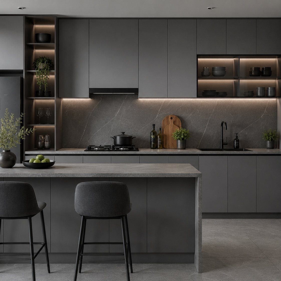
Two shades of gray layered in one space give you contrast without introducing a second color.
Charcoal lower cabinets with a soft gray countertop or backsplash add definition while keeping the palette cohesive, and the pairing works in kitchens where stainless appliances already anchor the room.
Matte charcoal shows fingerprints, so a satin finish cleans up easier. Soft gray stone or quartz countertops hide water spots better than white and still feel light against the darker base.
The combination needs good lighting to keep the charcoal from reading too heavy.
15. Cream and Beige

The two sit close enough on the spectrum that they register as a single warm backdrop. The pairing works in kitchens where stark white feels too cold but you still want the space to feel open.
Glossy cabinets reflect more light than matte, which matters in a kitchen with limited natural light or darker flooring. Beige hides dust and cooking splashes better than cream, so the glossy finish stays cleaner longer without constant wiping.
A white counter or backsplash introduces contrast so the neutrals do not flatten into one unbroken surface.
16. Deep Green and Oak

Deep green upper cabinets against oak lower cabinetry split the color weight and prevent the space from reading too heavy.
The oak warms up the green, and the combination works in kitchens where wood floors or beams already set the tone.
Green fades faster in direct sun, so reserve it for cabinets that do not sit under a south-facing window. Oak holds its finish longer and needs less maintenance than painted surfaces.
If the green feels too heavy, keeping it on the lowers only and pairing it with lighter wood on top balances the weight.
17. Emerald Green and White

Emerald cabinets give a kitchen a bold, saturated color that reads jewel-toned rather than pastel. White countertops and backsplash keep the green from overwhelming the room, and gold hardware warms up both without competing.
The color shows grease and fingerprints more than lighter greens, so a semi-gloss or satin finish wipes down easier than matte. In a kitchen without much daylight, emerald can look black; test a sample under your lighting before committing.
If the green feels too intense, use it on the island or lower cabinets only and keep the uppers white.
18. Green and Brown

Sage cabinets with a wood island or countertop bring together a soft green and a natural brown without the coolness of gray or the starkness of white.
The wood anchors the green visually, and the pairing fits kitchens where existing tile or flooring already carries warmth.
Sage shows cooking splatter more than darker greens, which means more frequent wipe-downs near the stove.
19. Green, Blue, and Brown

Forest green and ocean blue layered in one space add depth without splitting into two separate palettes.
If the green and blue sit too close in value, they read as a single color from across the room rather than a deliberate mix.
Both show wear faster than wood or neutrals in direct sun, so expect to repaint before the floor needs refinishing.
20. Cream and Wood

The wood adds texture and grounds the cream so the space does not feel washed out.
Oak or maple stay pale, walnut or cherry add depth.
The combination hides dust better than all-white cabinetry and pairs easily with brass or black hardware.
21. Soft Taupe

Taupe on its own, without a second color, gives you a single neutral that sits between warm and cool.
The palette works in kitchens where you want something lighter than gray but not as bright as white, and it hides minor scuffs and cooking splashes better than either.
A shade that reads warm at noon can shift pink or gray once you flip the lights on at night.
White countertops or a light backsplash add contrast so the taupe does not flatten the space.
Choose Color Around Fixed Finishes
Start with what stays. If the countertop, floor, or backsplash will remain, bring cabinet samples to the kitchen and hold them against those surfaces under the room’s actual lighting.
A cream that looks warm in the showroom can read yellow next to beige tile, and a gray that looks neutral on its own can pull blue beside oak flooring.
A kitchen that faces north picks up cooler, indirect daylight that pulls blue and gray forward. South and west light adds warmth in the afternoon, which can push a neutral paint toward peach or pink.
If the kitchen opens to another room, compare the new color to the wall it will meet; a visible shift reads as a mistake, not a design choice.
For a full remodel, approve cabinet, countertop, backsplash, and flooring samples together before ordering anything.
That chip of granite is 2 inches across and shows you almost nothing about the veining that runs through the full slab, and I want that pattern sitting next to the door finish before anyone locks in the order.
Balance Longevity and Personal Style
Cabinet paint costs more to change than wall paint. The labor is longer, the surface prep is harder, and a new door color means pulling hardware, taping glass, and working around appliances.
If the color feels like a risk, put it somewhere smaller first: an accent wall, the backsplash, or an island you can repaint on a weekend.
Neutral cabinetry redecorates more easily. White, gray, taupe, or wood cabinets let you shift the room’s feel with new hardware, a different backsplash, or a coat of paint on the walls.
A bold cabinet color sets the tone for the whole kitchen, and everything else has to work with it.
Resale guides lean neutral for the same reason: a buyer who likes your emerald cabinets will make an offer, but one who does not will factor in the repainting cost.
Pick a color you can live with for at least 5 years.
Account for Light and Room Size
A lighter cabinet color makes a small kitchen feel bigger because it reflects more light back into the room.
Darker colors absorb light and visually close in the space, which works in a large kitchen where you want the room to feel cozier but backfires in a galley or single-wall layout.
Natural light changes how a color reads. A pale blue cabinet that looks soft beside a window can turn gray or washed out on the opposite wall where only overhead lighting reaches.
If your kitchen has limited daylight, a higher-sheen or semi-gloss finish reflects more artificial light than matte and keeps the color from going flat.
Bulb choice matters as much as paint.
Color temperature, measured in Kelvin, runs warm below 3000K and cool above 4000K. Color Rendering Index runs on a 100-point scale and tells you how honestly a bulb shows color; I stay at 90 or higher in a kitchen.
Set your bulbs before you approve a paint sample, because a color shifts under different lighting.
Frequently Asked Questions
What is the best color to paint kitchen cabinets?
Neutrals last because changing cabinet paint means more work than rolling a new wall color.
White stays the most popular choice since it opens up the space and pairs with almost anything you add later. Gray, taupe, and natural wood finishes also redecorate easily without locking you into one style.
What color kitchen cabinets never go out of fashion?
White cabinets stay timeless because they work with any countertop, flooring, or hardware you swap in over the years.
They also appeal to buyers if you sell, which keeps resale value steady. Natural wood finishes hold up the same way since both give you a neutral base that adapts instead of dating.
What should you consider when choosing kitchen cabinet colors?
Start with what stays: flooring, countertops, or tile you will not replace. Test samples against counters and backsplash in morning and evening light since the same shade can read warm at lunch and cool under LEDs.
Choose one you can stand for 5 years minimum since cabinet painting runs three times what walls cost.
Is matte or gloss better for kitchen cabinets?
Satin and semi-gloss clean faster than matte and show fewer prints than high-gloss.
Matte black shows every smudge, and glossy finishes make minor imperfections in the paint stand out under kitchen lighting. Satin splits the difference: it cleans up without the glare.
What is the most popular color for a kitchen?
White still leads, but navy, sage, and deeper jewel tones like emerald are gaining ground.
Taupe and warm grays also rank high since they hide cooking splashes better than pure white without the weight of black. The shift is toward color on lower cabinets or the island, with white uppers keeping the room open.
What is the best color for a small kitchen?
Light cabinets reflect more light back into the room, which makes a small kitchen feel bigger.
White, cream, soft gray, or light wood tones keep the ceiling from pressing down. Put color on the island or lower run and leave uppers light to hold the ceiling height.
How do I choose the right kitchen color combination for a small space?
Stick to pairings with minimal contrast like white and light gray, cream and beige, or soft green and white.
Lighter combinations bounce more light around the room, which opens it up visually. Avoid splitting the space evenly between two bold colors since that chops the room into smaller sections instead of letting it read as one continuous area.
What are the best modern kitchen color combinations for long-term value?
White with warm wood, gray with white, and taupe with cream age well because they adapt to different hardware, countertops, and backsplashes over time.
Black lower cabinets with white uppers also hold value since the contrast stays sharp without tying you to one trend. All 4 combinations appeal to buyers, which protects resale.